Lucrum POS
Cashier acceptance went from 92 to 96 percent across more than 30,000 transactions.
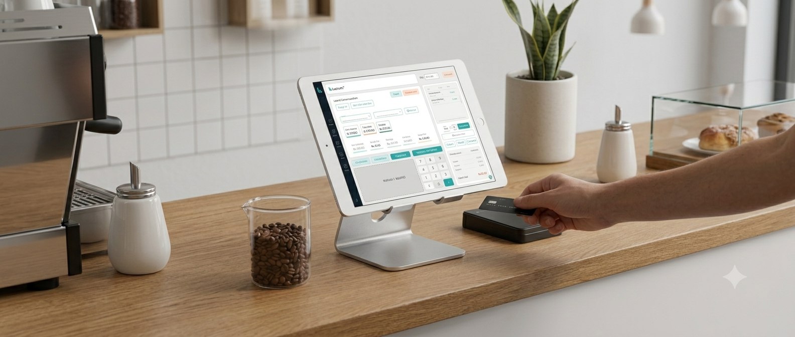
Problem and impact
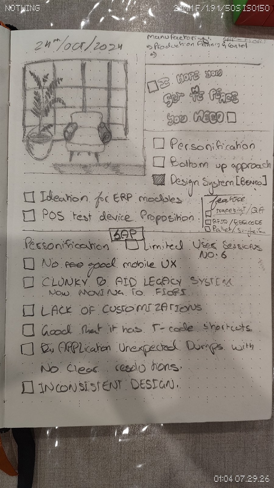
01 / 09The previous point of sale system was a clunky, legacy tool. Customization was limited, its reporting produced data dumps with no clear resolution path, and the visual design was inconsistent from screen to screen, which caused frustration and slowed cashiers down at checkout. The one thing worth carrying forward was its keyboard shortcut system, everything else needed rebuilding around a design language that could scale, which is what led to the bento style layout used throughout. This redesign set out to present decisions more intuitively, streamline everyday workflows, and lift sales and revenue, measured against transaction time, error rate, and user satisfaction.
View old applications →









 Coffee Layers
 Craving


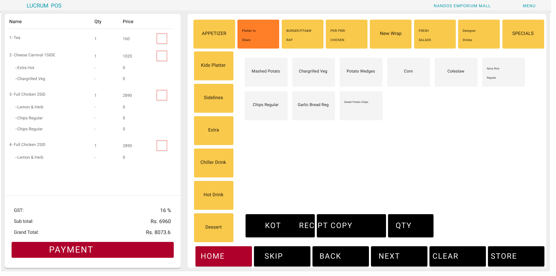
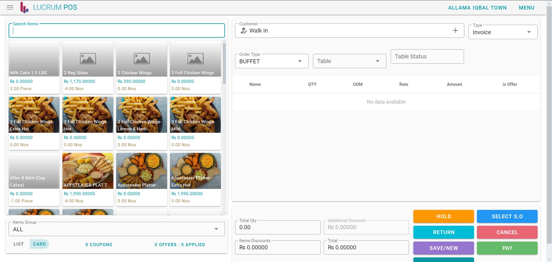
Scope and role
02 / 09I led discovery and design on this end to end: the research loop, the flows, the design system, and the sign-off passes that got it into cashiers' hands. The register was the visible part. Most of the work was agreeing what a transaction actually is with the people who run the floor.
The part that mattered most was the least visible: no flow was signed off in Figma alone. Each went through a field inspection with the operations lead first, which is why so few of them came back after build.
Research
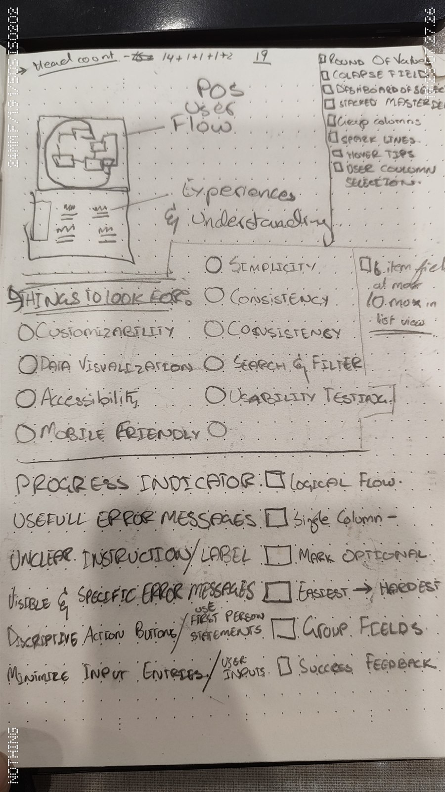
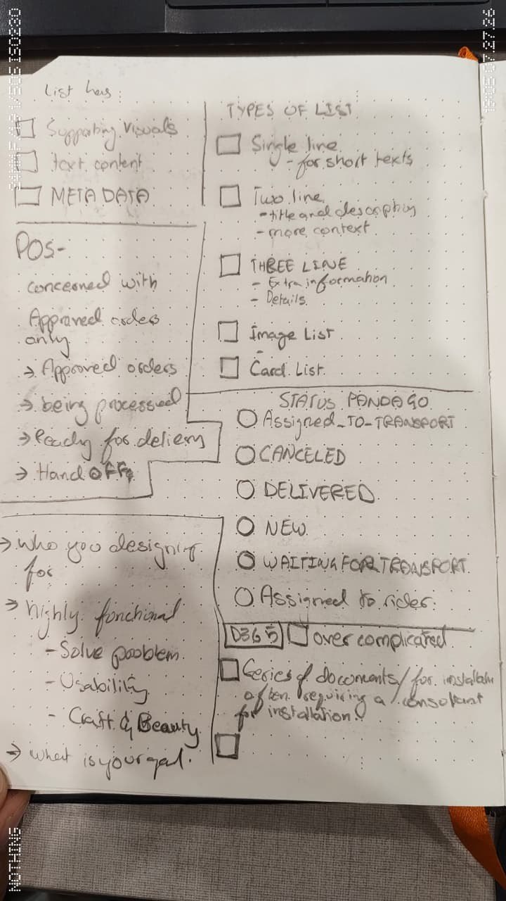
03 / 09Before Figma opened, the process ran through a fixed loop: review goals, gather research, list every touchpoint a cashier hits in a shift, sketch an empathy map, translate that into a user journey, then refine and digitize it before wireframing anything. Alongside direct feedback from cashiers, I benchmarked how existing POS platforms and hospitality kiosks handled the same moments, self checkout, drive through queuing, priority orders, to see which patterns held up under real transaction pressure rather than just looking clean in a deck.
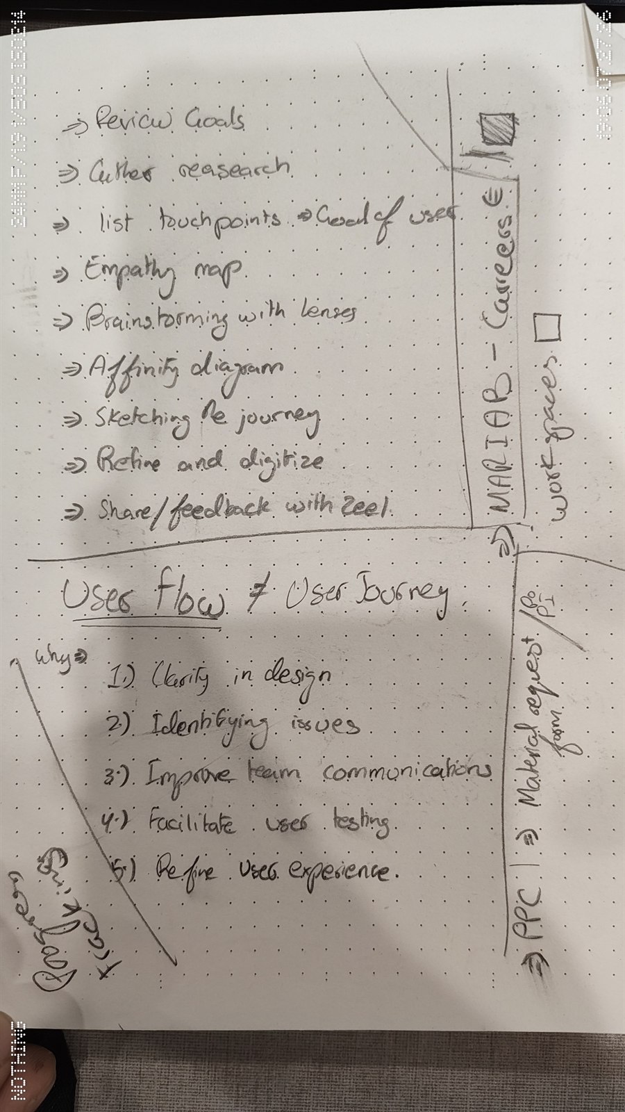
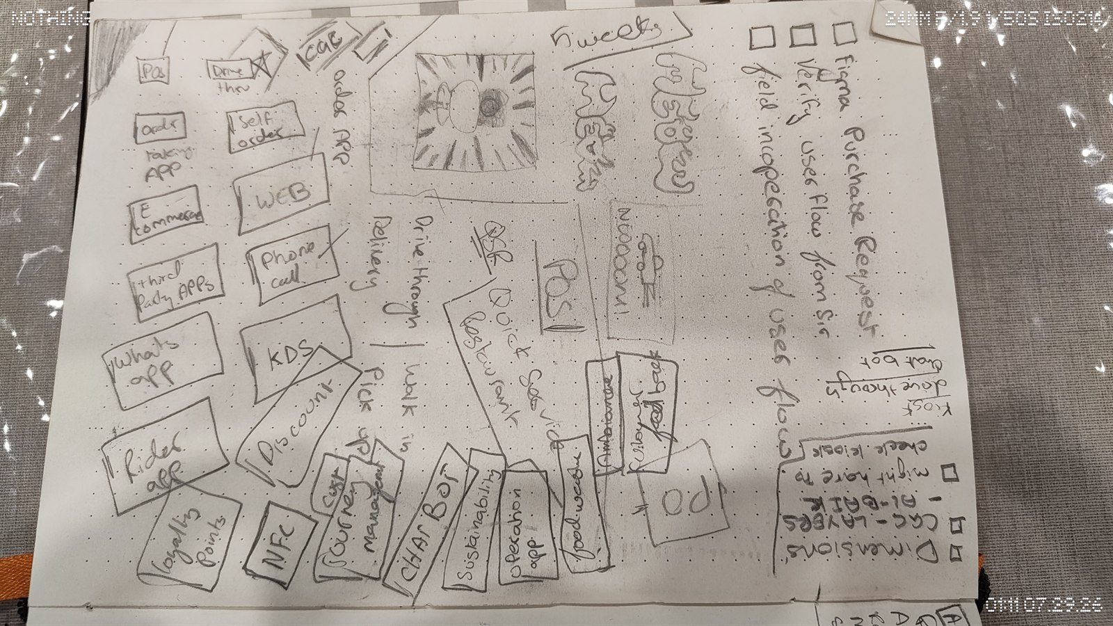
Scope wasn't limited to the register itself. Early on I mapped every channel an order could come through, drive through, delivery, walk in, pickup, against every touchpoint that needed to support it, order app, web, phone call, KDS, self order kiosk, e-commerce, third party apps, WhatsApp, and the rider app, so decisions made for the register stayed consistent with everywhere else an order could originate. Flows weren't signed off in Figma alone either. Each one went through a field inspection and a verification pass with the operations lead before it moved into wireframes.
Process
04 / 09Research & Ideation
Wireframes & User Flows
High Fidelity Design
Testing & Iteration
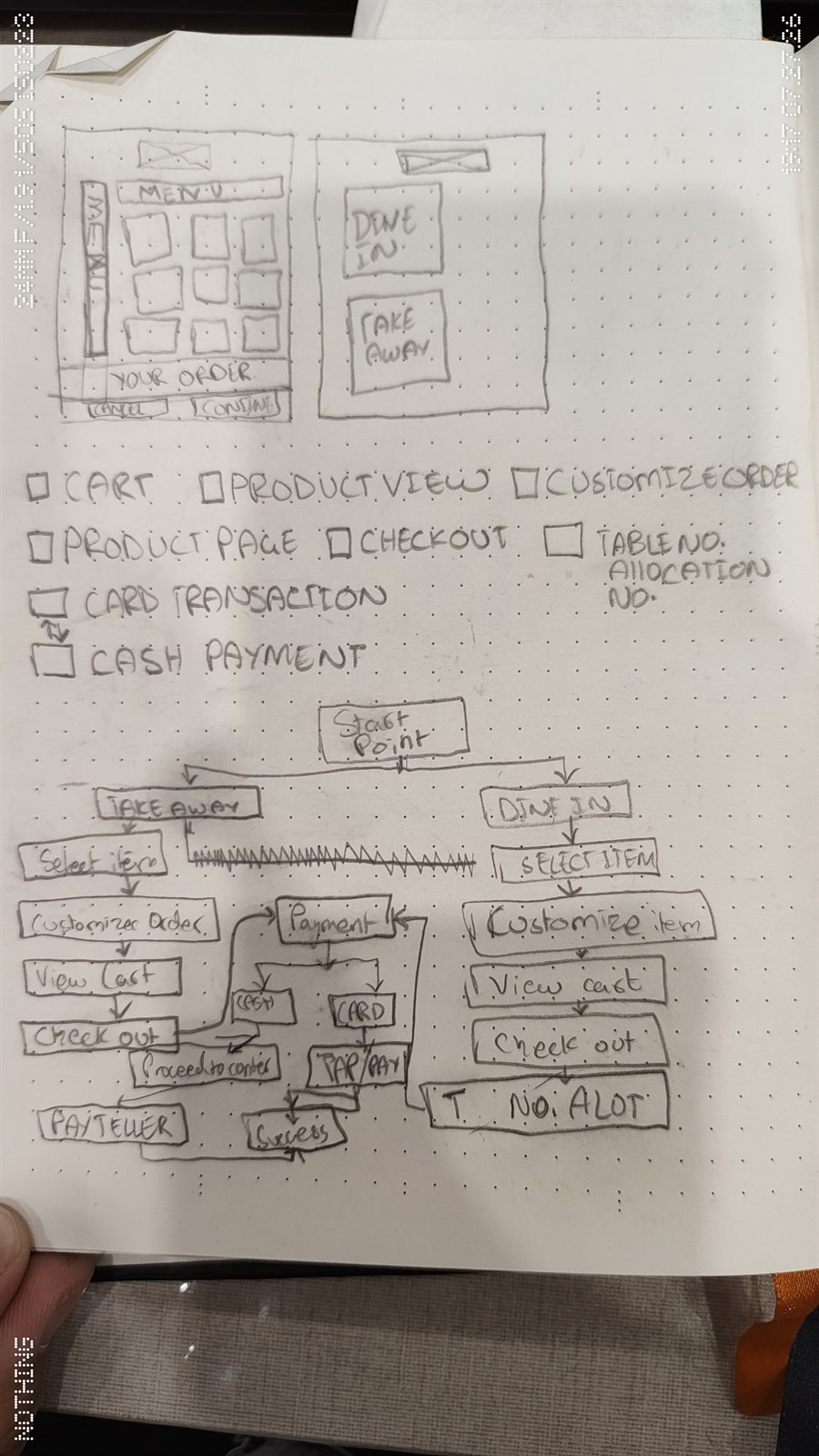
Early exploration went wider than the register itself. Concepts for a companion customer ordering app, a rider app, and delivery partner integrations were sketched alongside the POS to see how much of the design system could be shared across all of them. That consumer facing track was set aside to keep the initial POS rollout focused, but it's part of why the component library was built modular from day one, the toolbar, product tiles, and cart line items were designed to be reusable well beyond the register.
Branding
05 / 09
Oo Pp Qq Rr Ss Tt Uu Vv Ww Xx Yy Zz

A dark theme was designed alongside this one: a full set of screens on the real product data, not a mockup. It never went live. Rolling a theme change across every client instance was a bigger deployment job than the change was worth, so it stayed in the file.
Worth saying plainly, because it is the more common way design work dies: not rejected in a review, just outrun by what it would cost to deploy. It is also why the palette above is built to hold up in one theme rather than assuming a second would arrive.
User flow and components
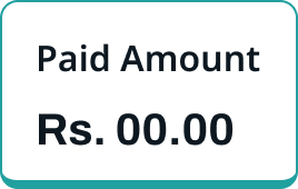
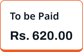
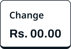
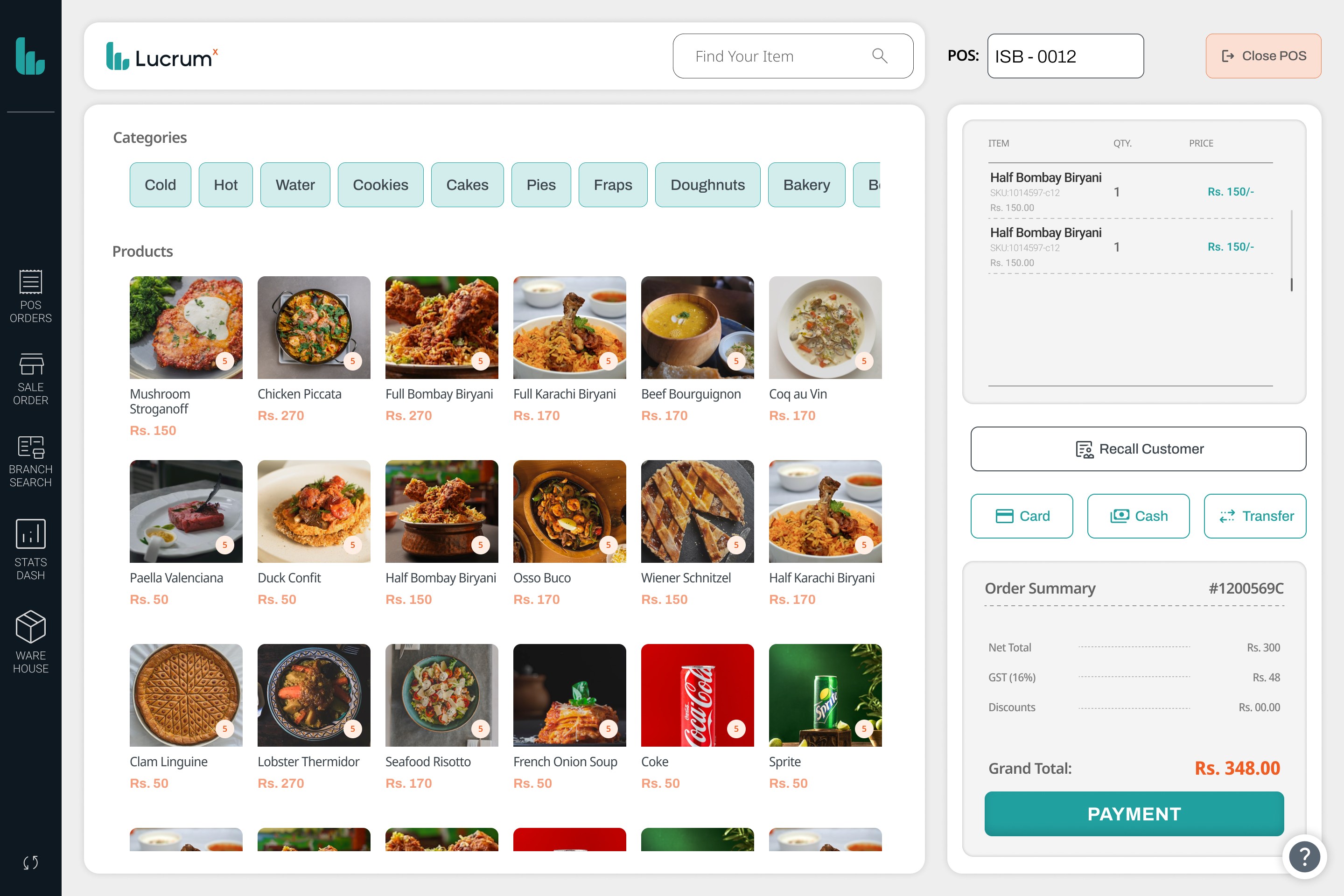
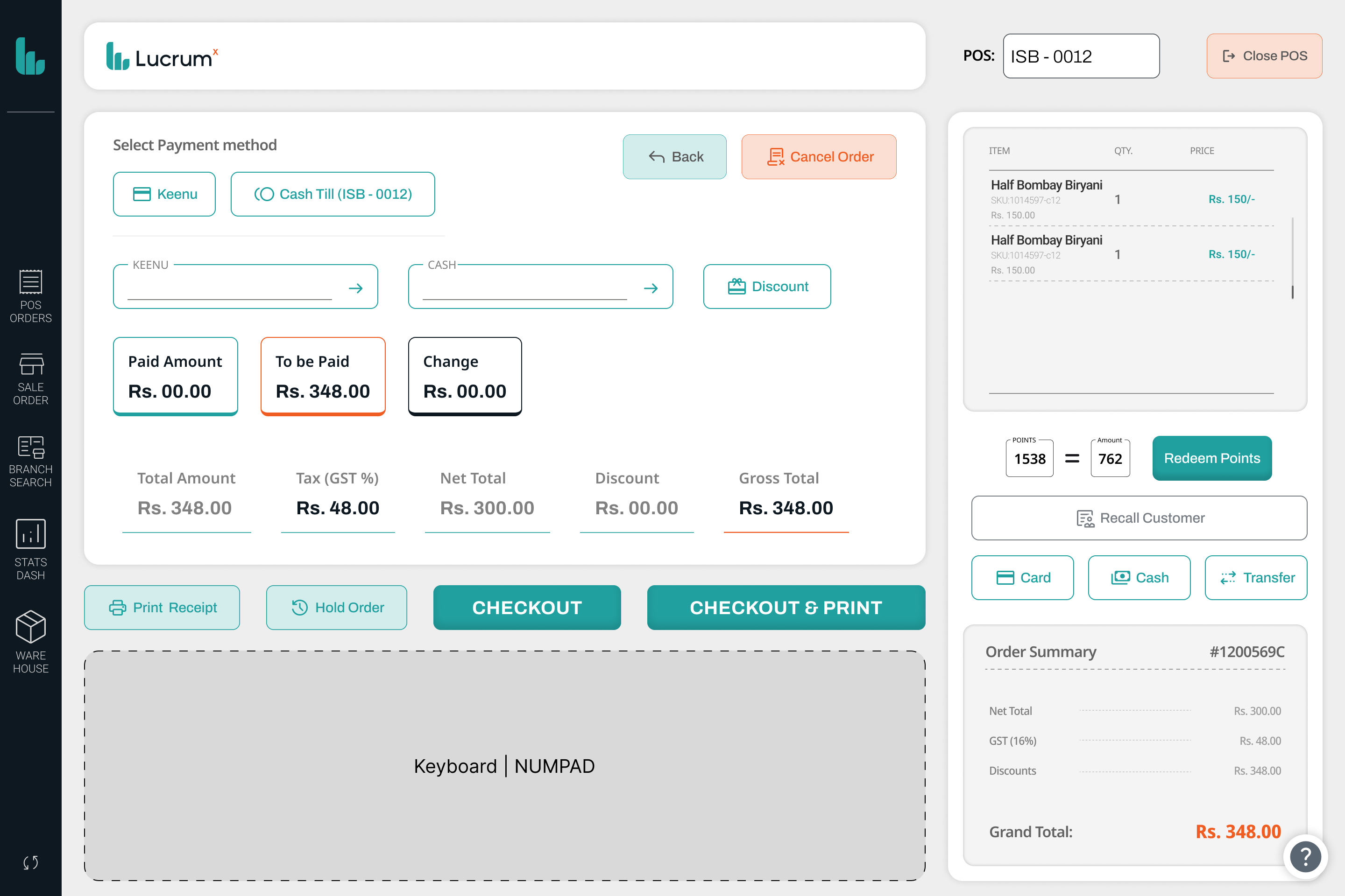
06 / 09At the counter, a cashier searches for an item, adjusts quantity or applies a discount, and sends it to the cart in a couple of taps. Redeeming loyalty points, calculating change, and choosing a payment type all live on the same payment screen, so nothing requires a separate trip through a menu.
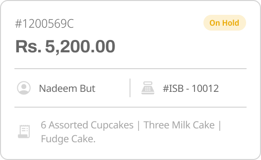
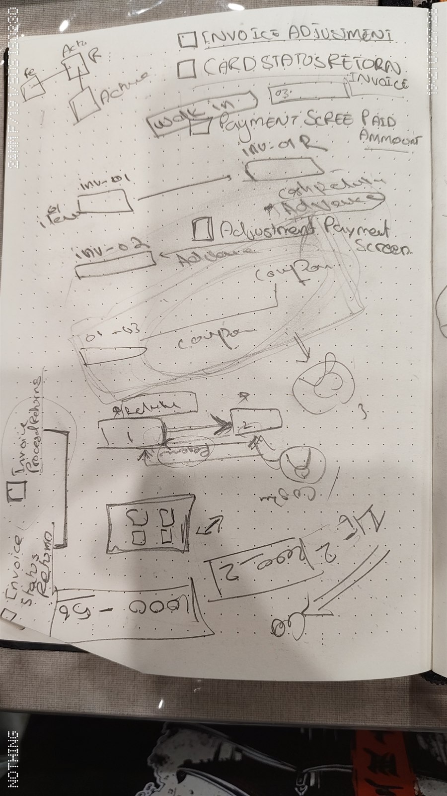
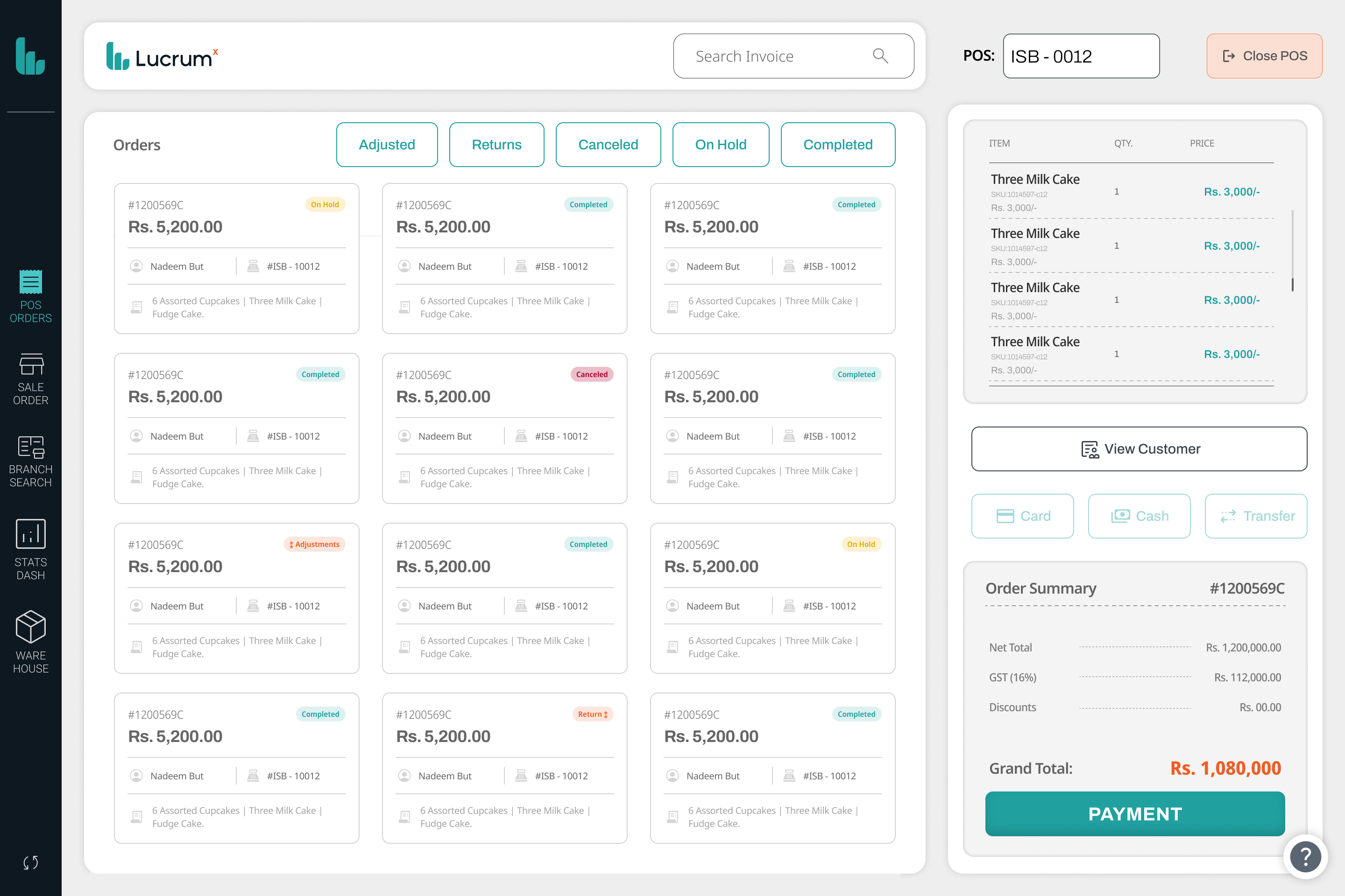
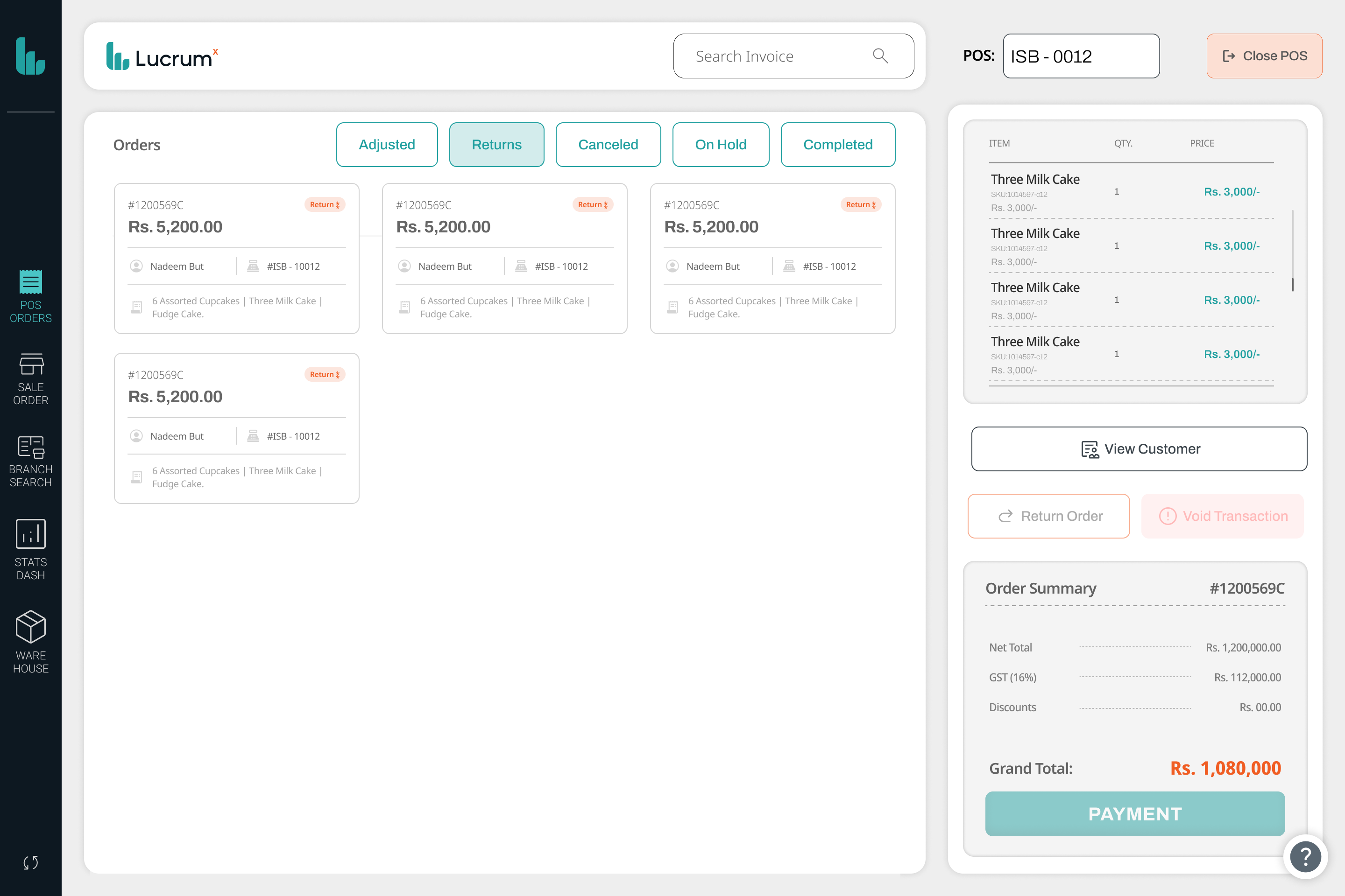
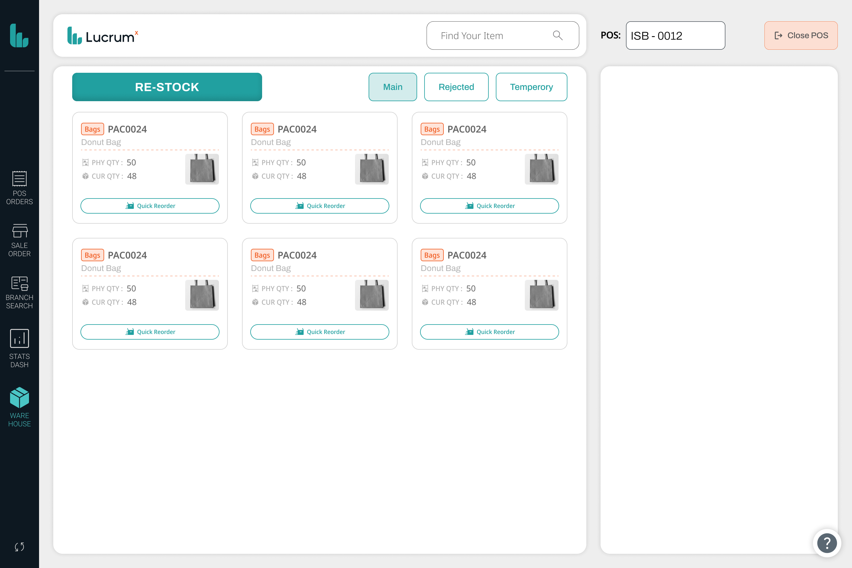
Not every transaction goes smoothly. Cashiers can void a transaction before it completes, cancel an order in progress, or process a return once it has gone through, without needing a manager override for the everyday cases. An order can also be placed on hold and pulled back up later through quick reorder, useful when a customer steps away mid purchase.
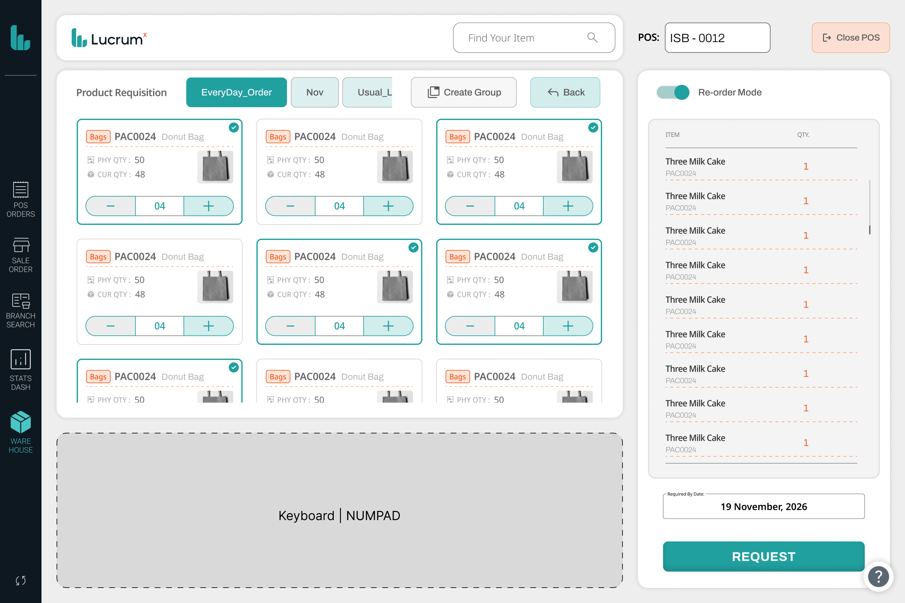
Five modules sit in the header at all times, POS Orders, Sale Order, Stats Dashboard, Warehouse, and Branch Search, so a cashier can check stock or glance at the day's numbers without leaving the till. Every order carries a reference number, a timestamp, and a status, new, processing, completed, or cancelled, so a manager can trace any transaction after the fact.
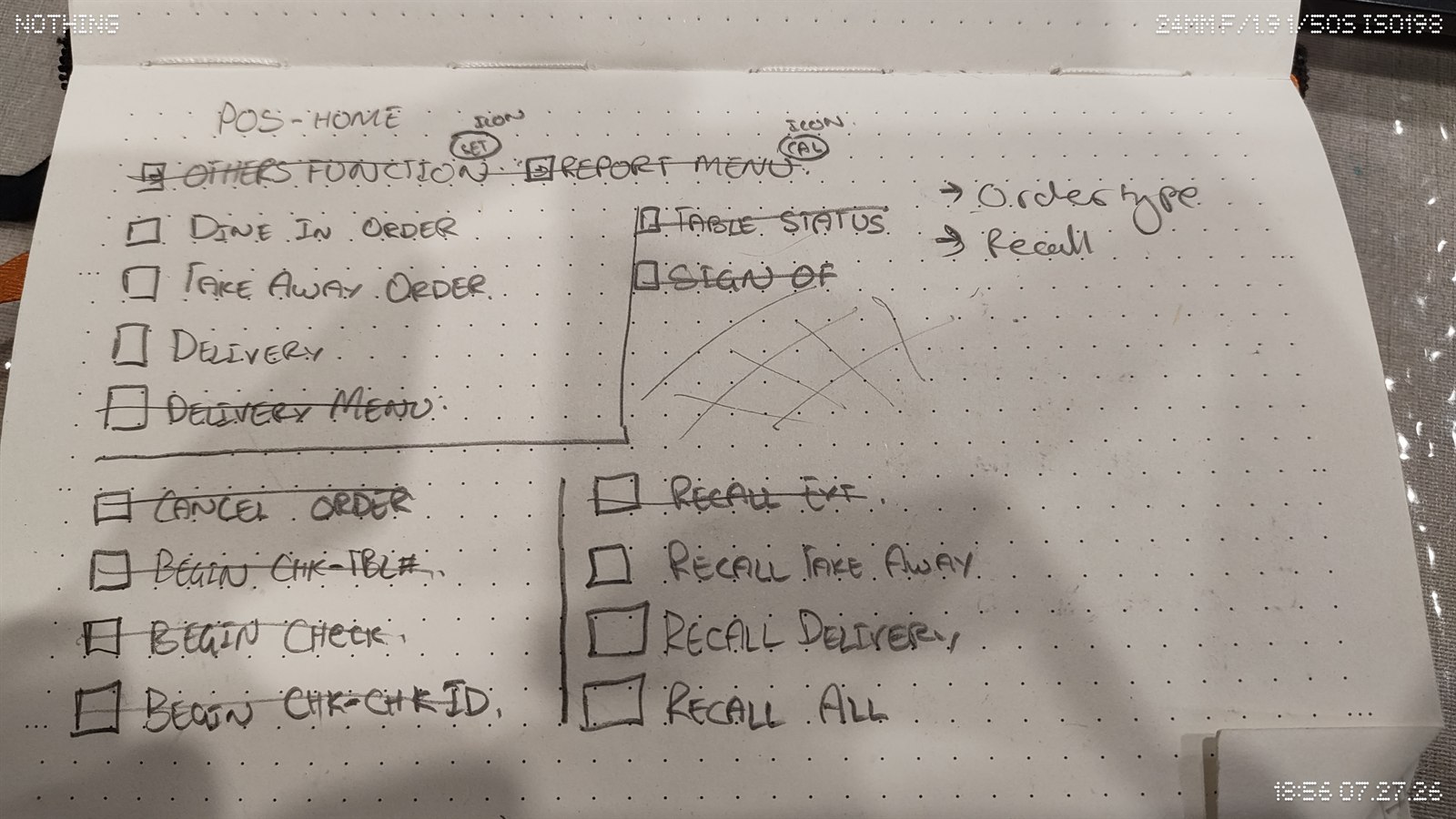
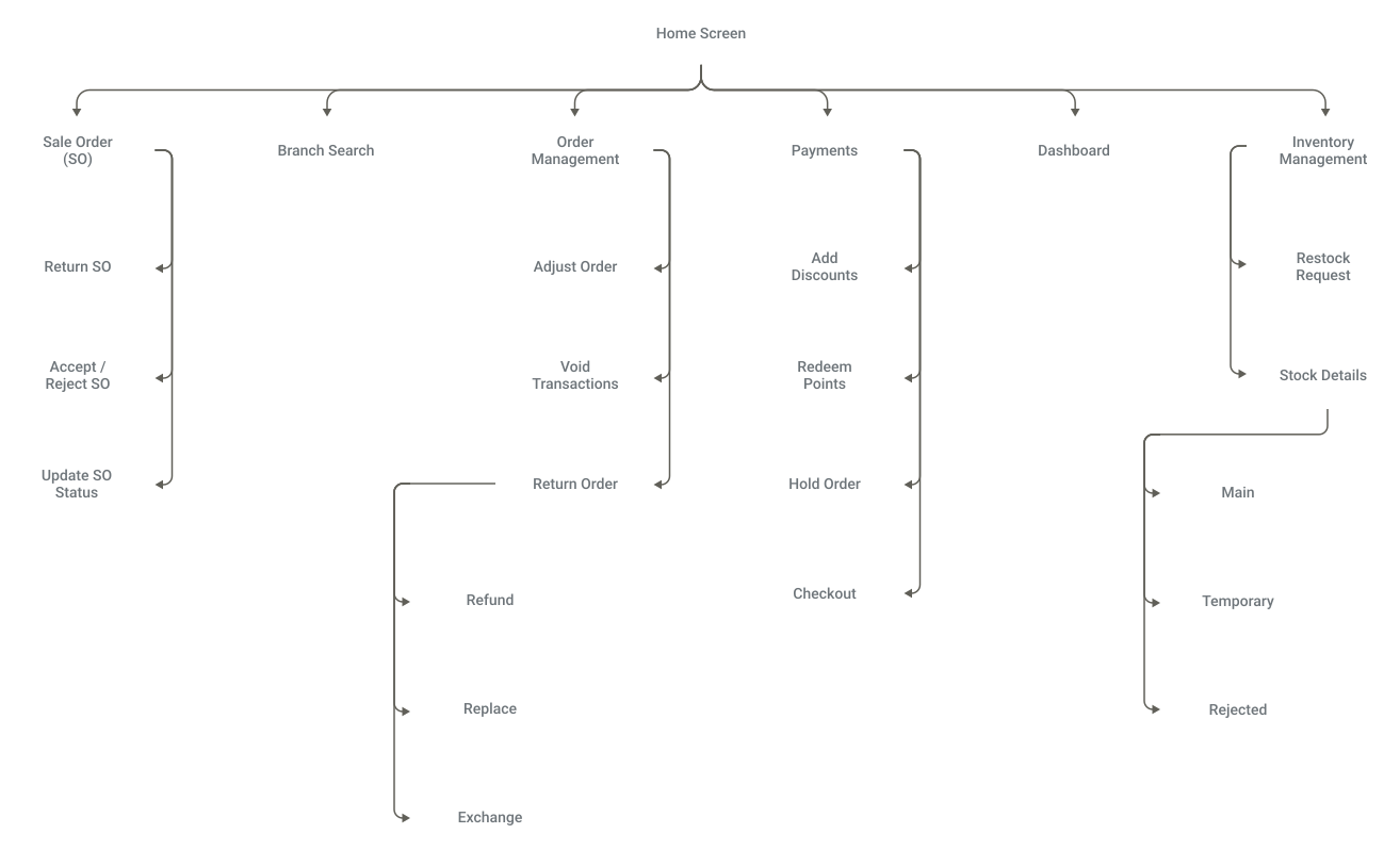
Everything reachable from the home screen, six top level modules, several with actions of their own branching off underneath.
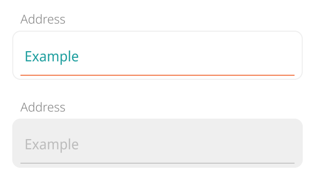
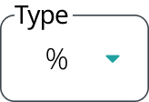
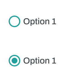
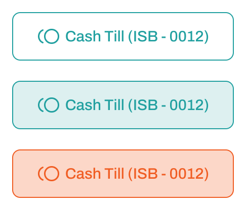
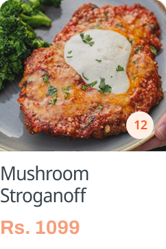
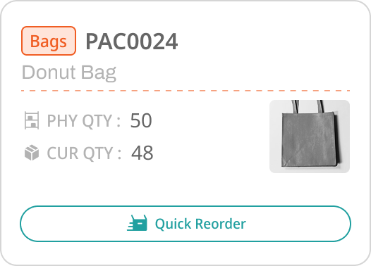
The interface is built from a small set of components reused everywhere they apply: a persistent navigation rail, text fields, dropdowns, radio and toggle controls, a search bar, a product card, a cart line item, an order card, stock cards, a coupon, a quantity stepper, the totals shown at checkout, status pills, a payment method row, and action buttons styled by context, filled for the primary action, outlined for a secondary one, and colored for confirmations, cancellations, and destructive actions, kept consistent as new screens got added.
















Interface subsystems
07 / 09Where those components come together as whole screens, grouped by the subsystem each one belongs to: the register and checkout, the order lifecycle, and warehouse replenishment. Select any screen to open it full size.
Register & checkout
Order lifecycle & returns
Warehouse & inventory
Reflection
08 / 09Revamping the interface for Lucrum's POS system was a turning point in how I think about design. The smallest decisions ended up making the biggest difference in how the system actually felt to use, every day. It taught me how to balance business goals with what people actually need, a lesson I still carry into every project I take on.
Muhammad Bin Saif, Product Designer
Diary notes / research
09 / 09A working notebook kept alongside Figma throughout the project, research loops, wireframe sketches, and the rules each screen had to follow.