Dagwood
A live storefront and a native app for a Lahore QSR chain, picking up orders organically before a single rupee of marketing.
The problem
01 / 09Dagwood is a quick service restaurant chain running two physical branches in Lahore, on PIA Road and Khayaban e Amin, open around the clock. Customers ordered by walking in or phoning ahead. There was no ordering website, no native app, no loyalty program, and no way to see where an order was once it left the kitchen.
The brand already had demand. What it needed was a channel that could hold it, and a native app to follow once that channel proved itself.
Scope and role
02 / 09Two products, one brand. The website shipped first and carries the live order volume today. The native app followed as a full design and handover package, now built and live on Google Play. Both ran on the same toolchain throughout (Figma, Claude and Lovable), with the website shipping as a React and Tailwind app and the native app handed over as a Flutter ready specification.
A live ordering storefront, directed through Lovable and deployed to a custom domain.
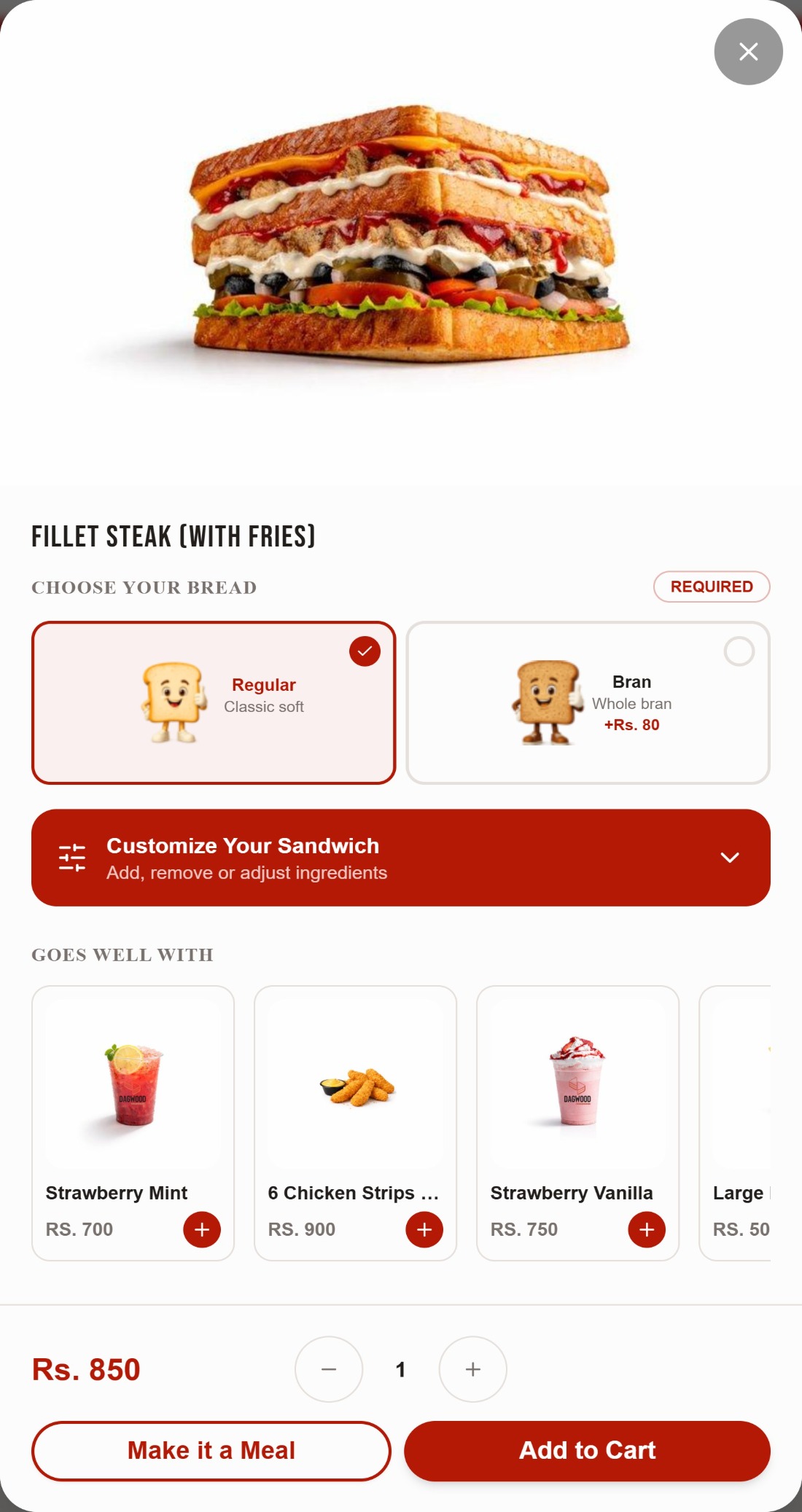
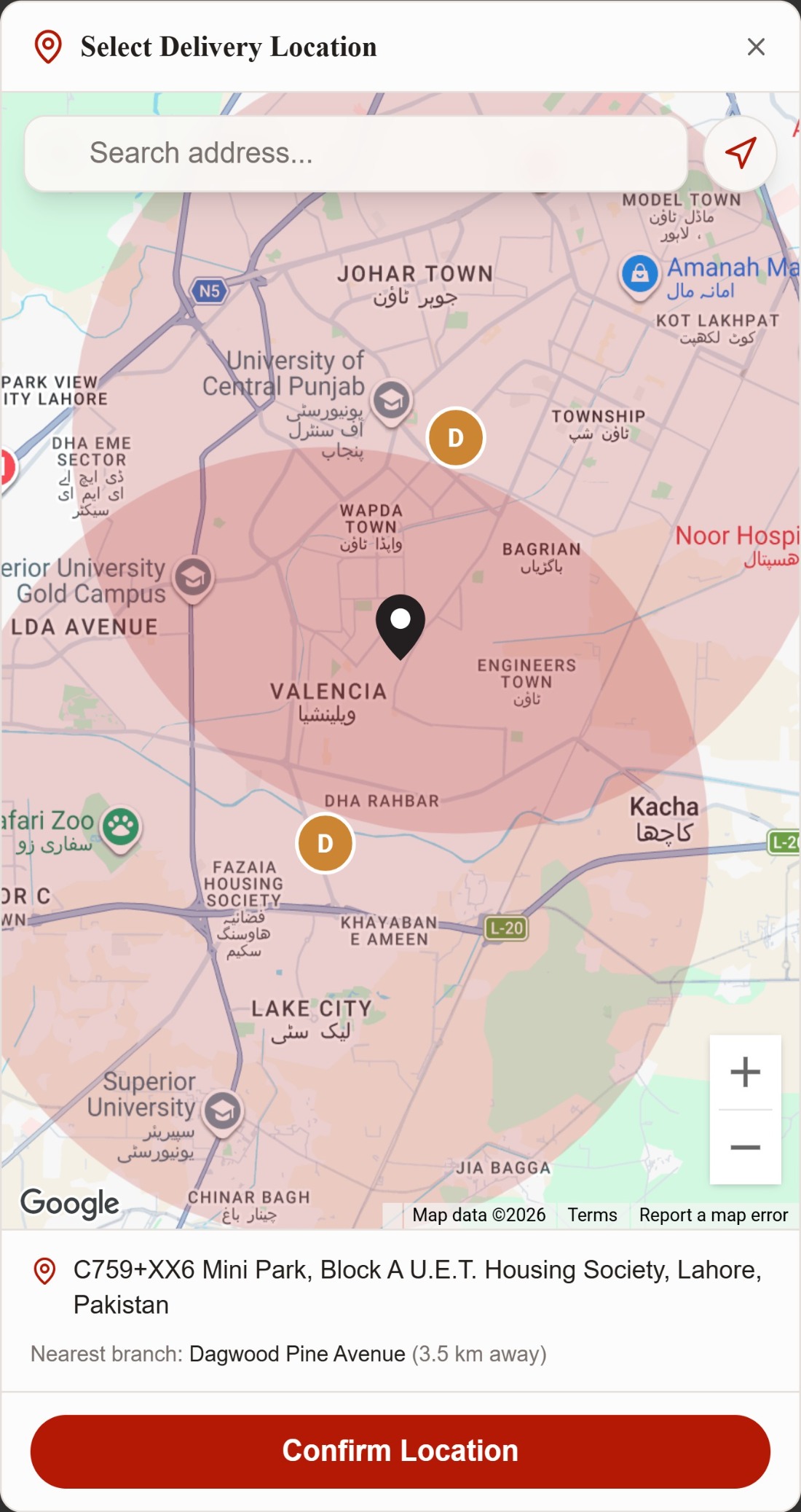
Menu browsing with category navigation, ingredient customisation, a persistent cart, phone verified checkout, a delivery radius map against both branches, and a WhatsApp ordering assistant built into the header and footer.A native app design system, handed to Flutter engineers.
A functional requirements document, a sixteen screen interactive prototype simulating every flow, a full token and component system, and a developer handover document. It shipped, and is now live on Google Play.The ordering website
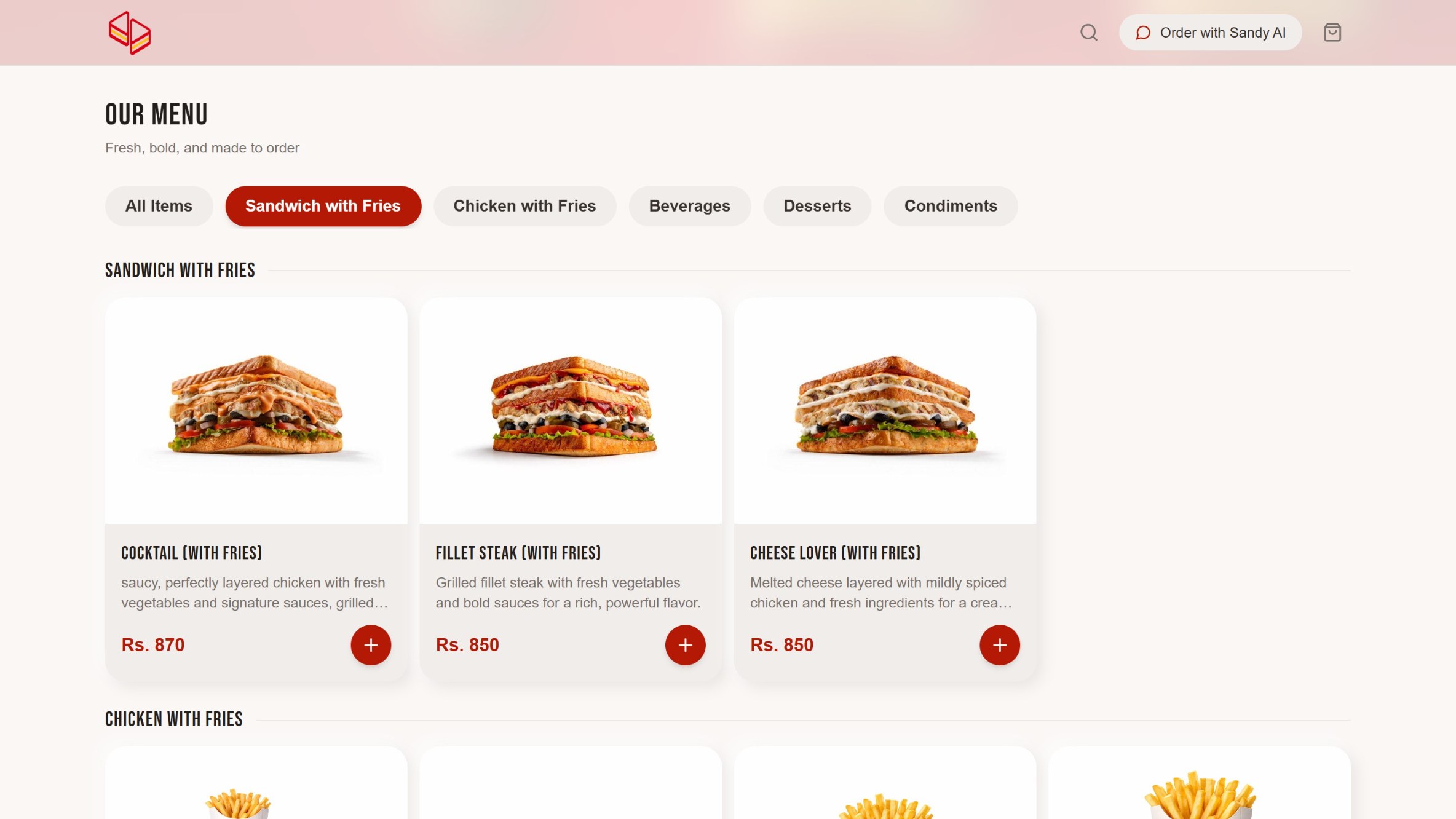
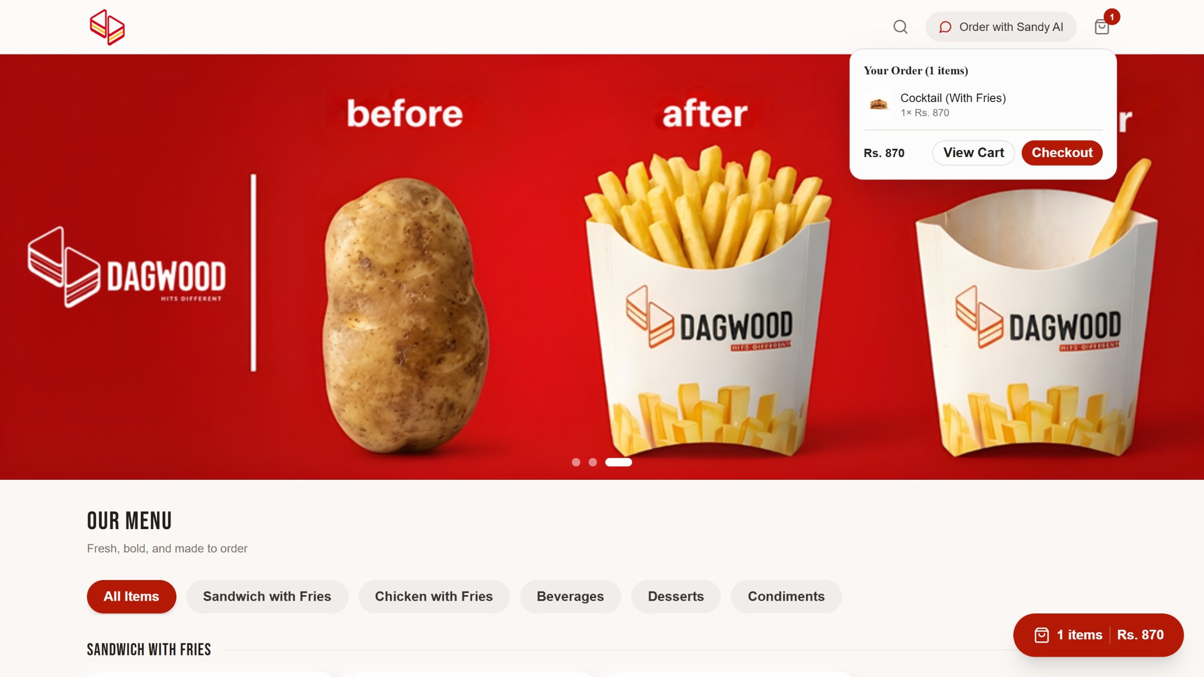
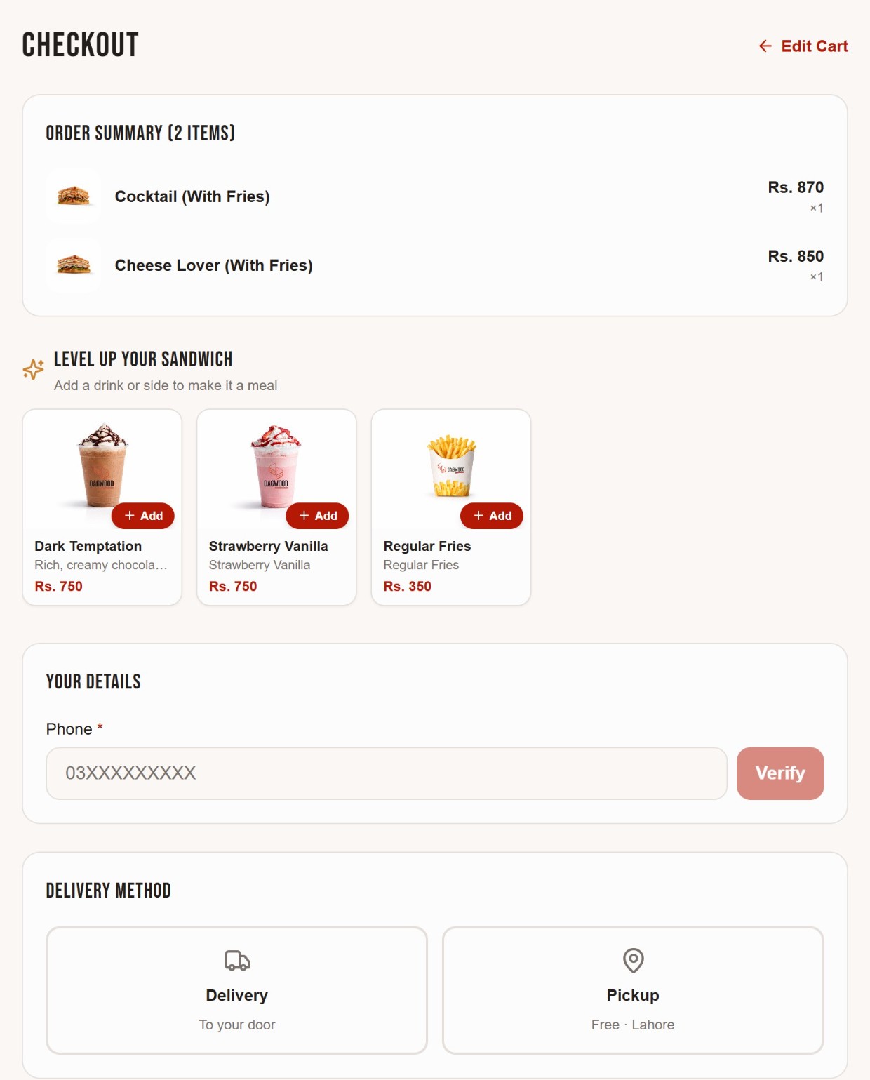
03 / 09This is the live product. Every screen below is a real, working part of dagwood.com.pk ↗ today: a scroll aware menu, ingredient level customisation, a persistent cart that follows the page, phone verified checkout, and a delivery picker that draws an actual radius around both branches and computes distance live.
Browse, cart and checkout
Customise and deliver
Sandy, the ordering assistant
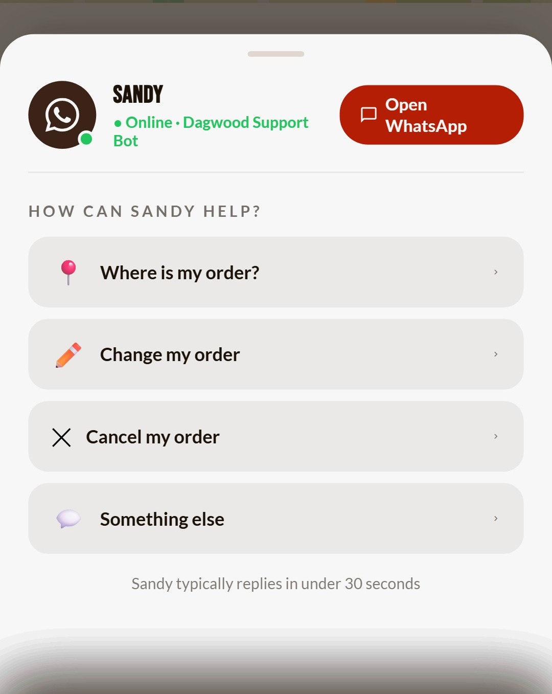
04 / 09Sandy was designed once and shipped twice, in two different forms.
A WhatsApp ordering assistant, live in the header and footer.
Every page carries an Order with Sandy AI entry point that opens a prefilled WhatsApp chat, so a customer can place a full order by conversation without touching the menu grid.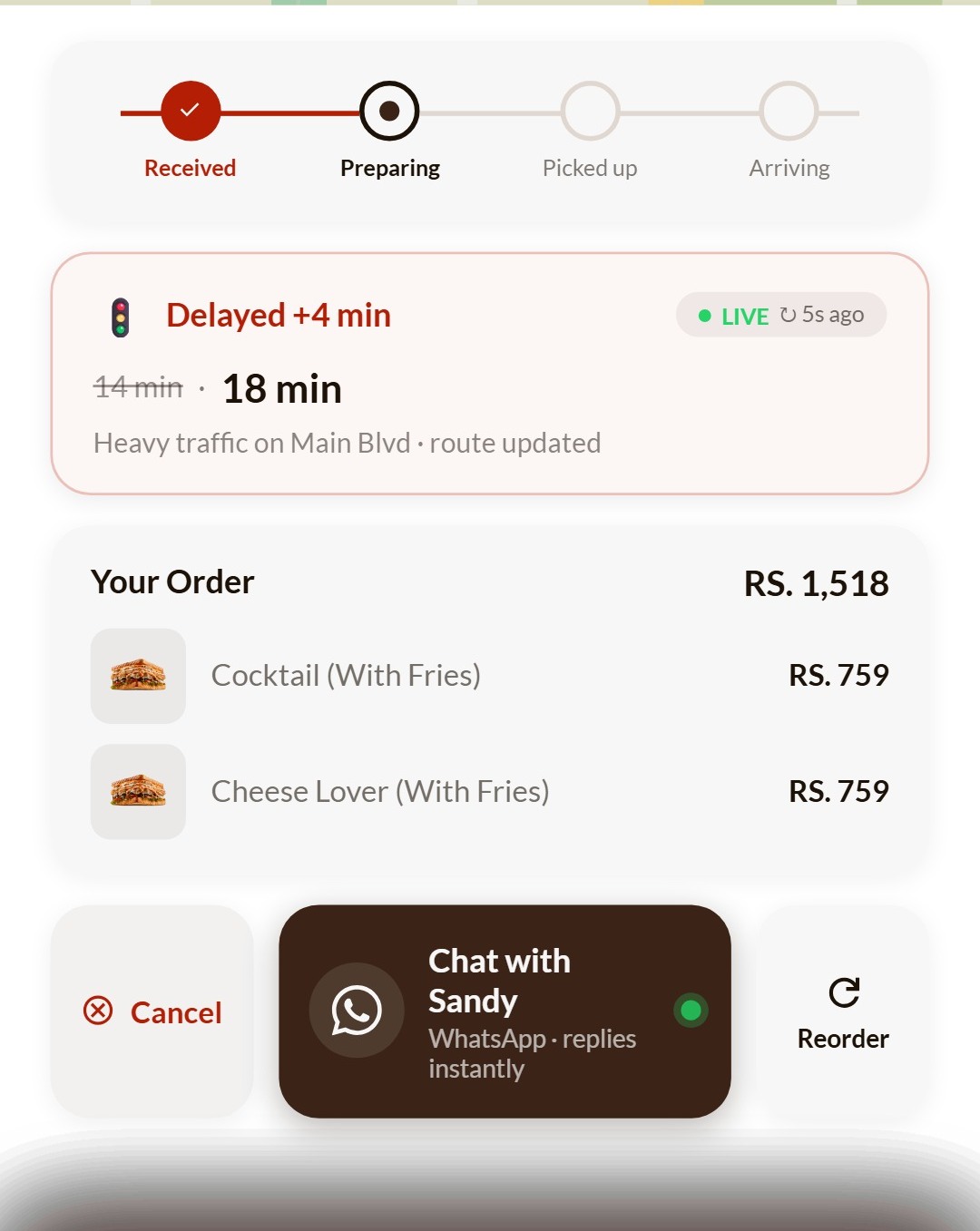
Menu and customisation
05 / 09One catalogue, shared by both surfaces: five categories, close to forty items, every price carried over exactly from the kitchen's own list. Customisation goes down to bread choice and individual ingredients, not just add ons.
From prototype to native app
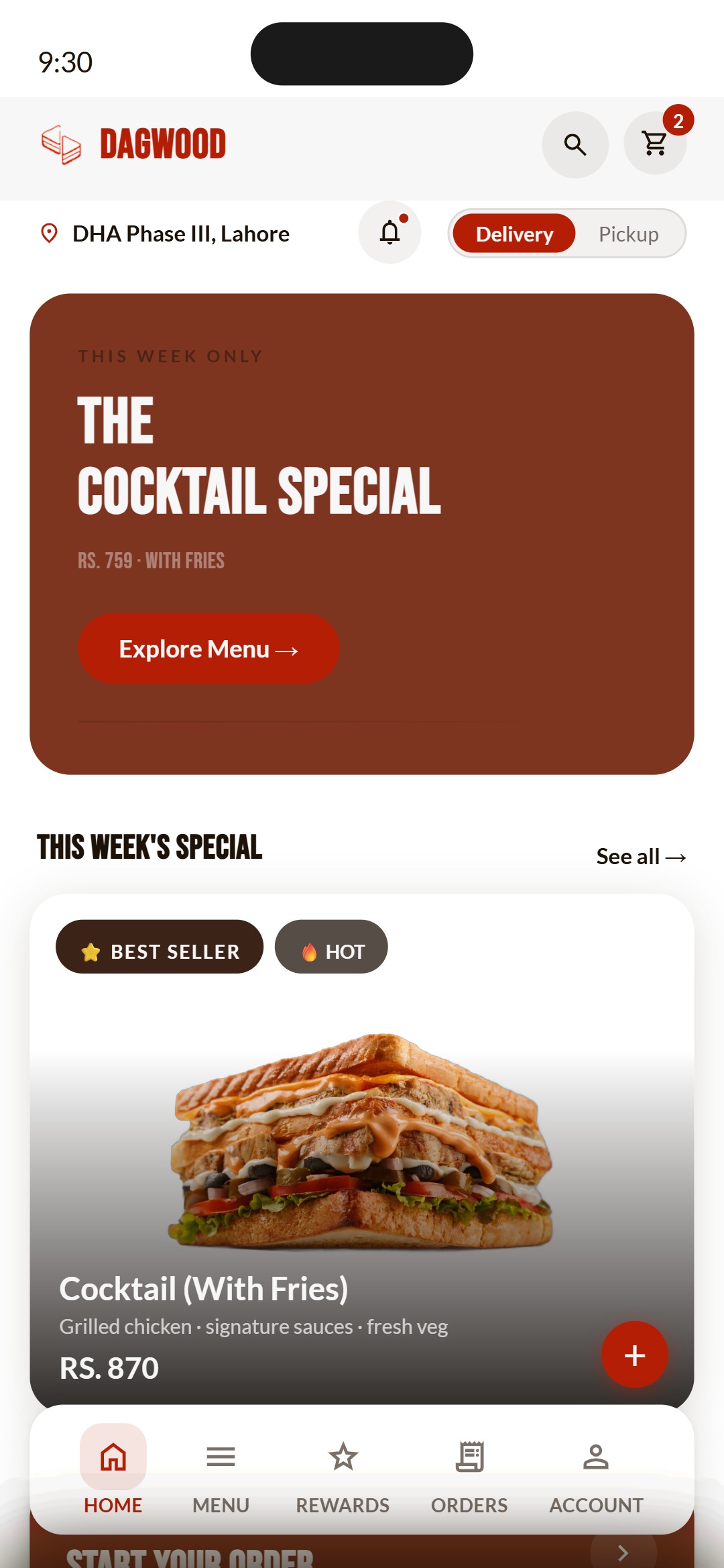
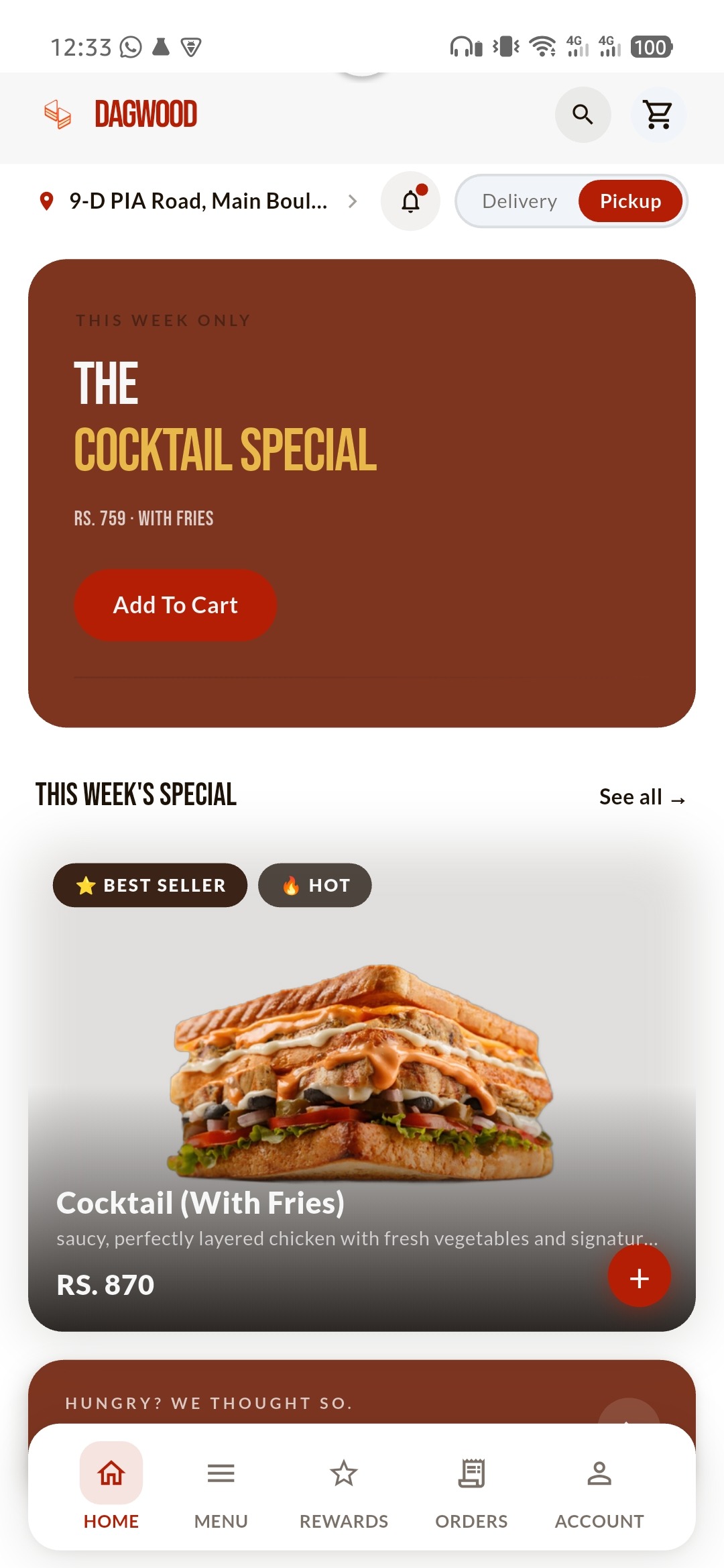
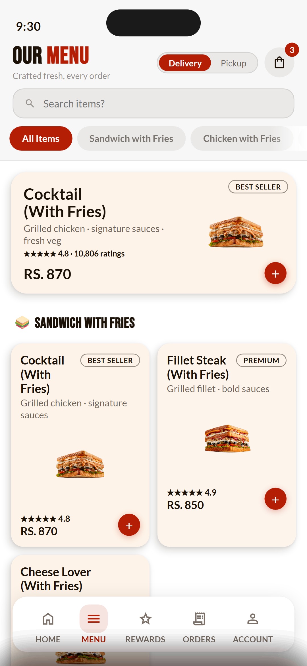
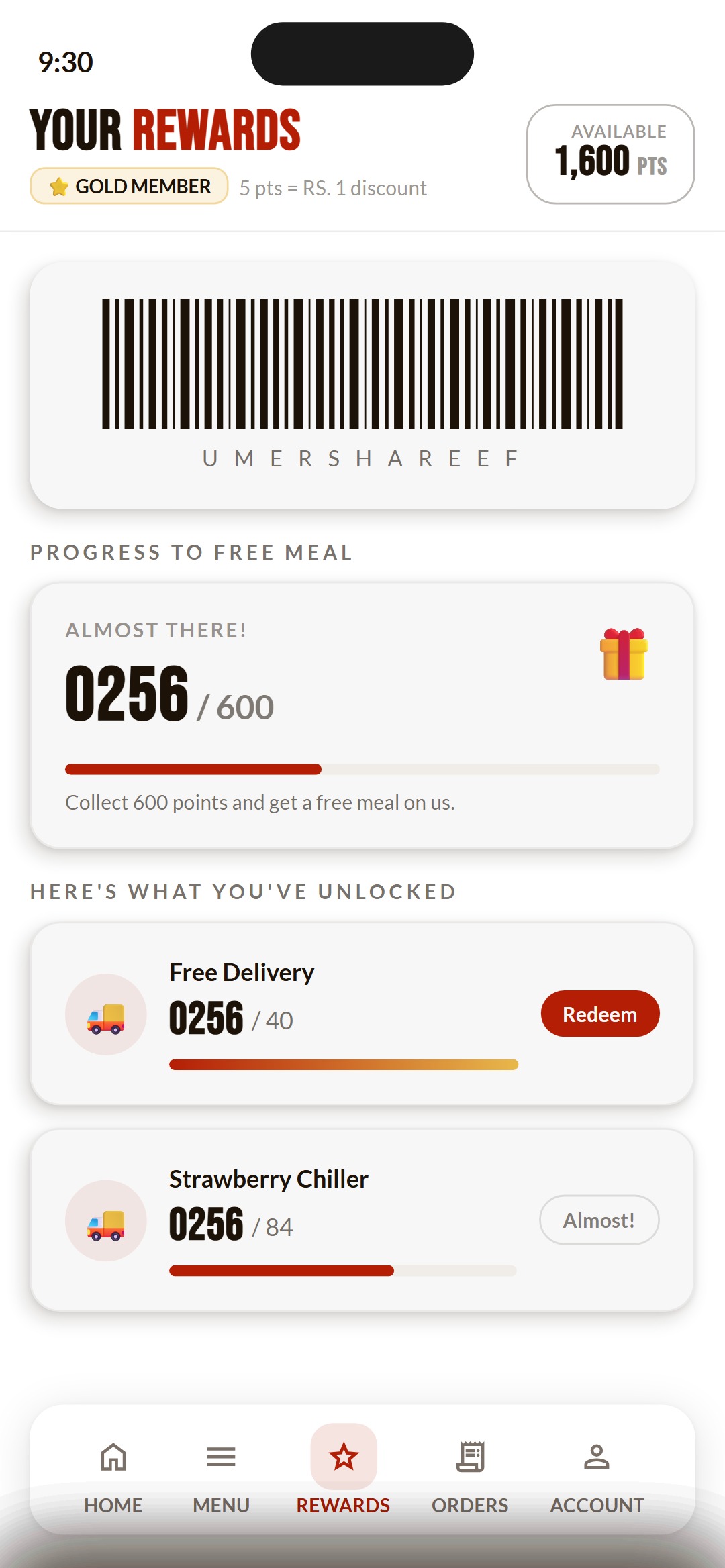
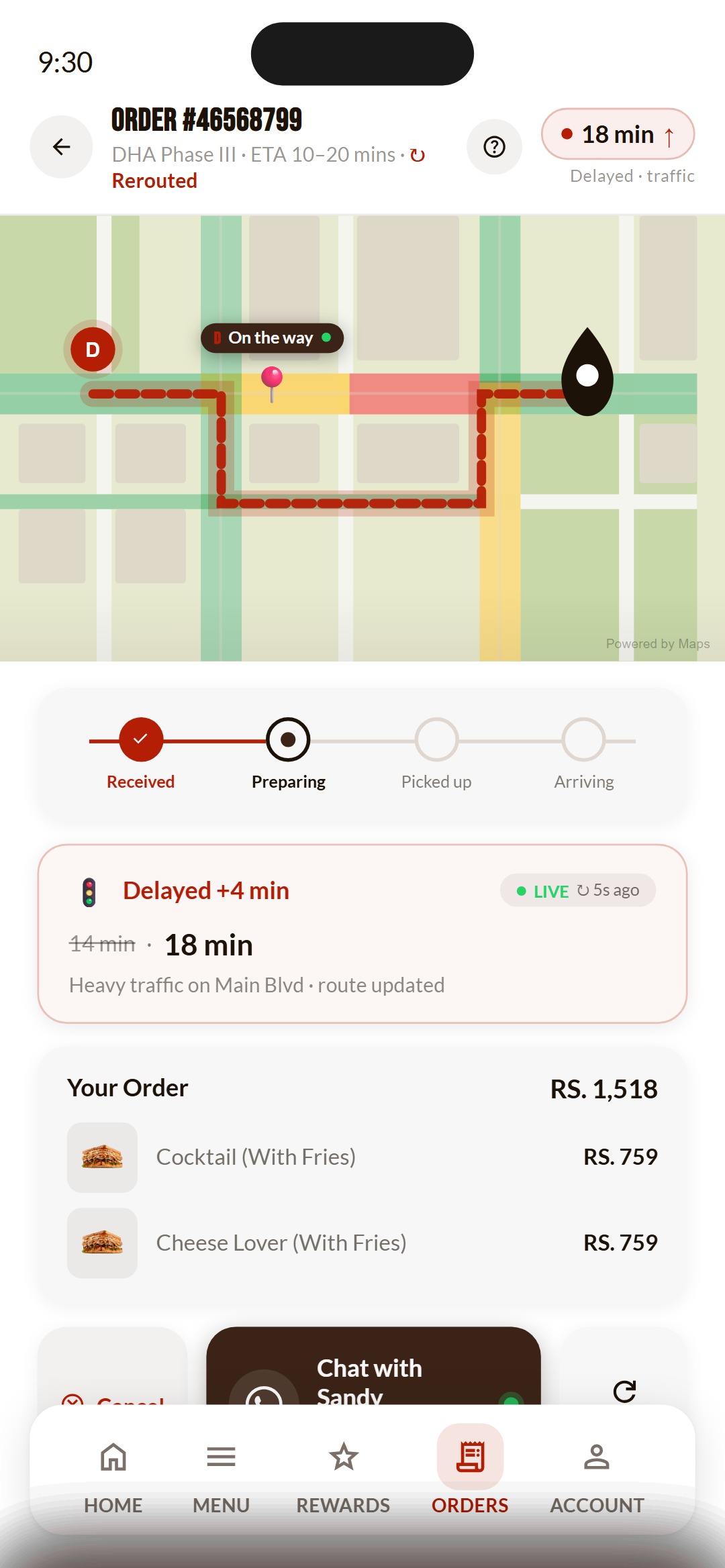
06 / 09The app side of Dagwood started as a functional requirements document and a sixteen screen interactive prototype, simulating the full order flow, a loyalty and points system, and live tracking. Alongside it, a developer handover document translated every colour, type style and component into a Flutter ready specification. The prototype was locked in April 2026. The app was live on Google Play by June 2026, built by a separate engineering team working from that handover.
Prototype and shipped app, side by side
More of the sixteen screen prototype
Design system
07 / 09Dagwood arrived with an eighty eight page brand book. The product design system is a deliberate subset of it: the parts that survive contact with a 390 pixel screen, carried identically across the prototype, the handover document and the live website.
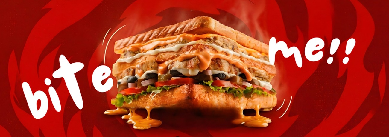
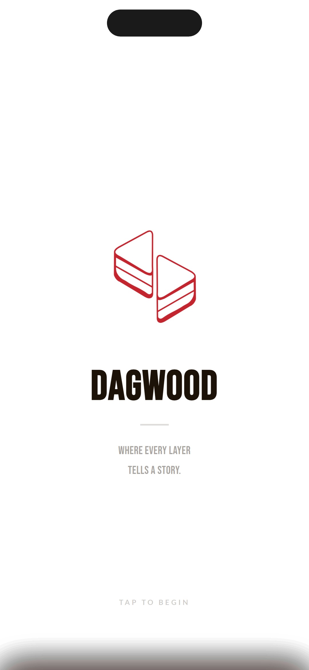
Lahore's boldest sandwiches, built in layers, crafted with heat.
Brand essence · DagBook v0.2 · splash animation from the appInterface palette
Four colours carry the whole interface. Three come from the brand book: two of them adjusted, because pure black and pure white are punishing across a long scrolling menu. The fourth had to be invented: nothing in the book covers a confirmed state, and an order tracker needs one.
One mark, three lockups
The book draws the lockup three ways rather than leaving the background to chance. The symbol keeps its orange on light and on black; on brand red the whole mark reverses to solid white, because orange on red is not a contrast a menu screen can carry.

Two typefaces, doing four jobs
Bebas Neue is a condensed all caps display face that holds a screen title or a price in very little width. Lato carries everything a caps face cannot: descriptions, ratings, form labels, error text.
The book asked for more than two. It assigns a different display face to each menu family: seven in all, one each for sandwiches, appetizers, drinks, milkshakes, donuts, sundaes and brownies. None of them shipped.
Seven faces is coherent in print, where a reader meets one family at a time. A menu screen scrolls all seven past you in a second, and type that changes by family reads as inconsistency rather than as a system. Two faces was the trade: less range, one voice down the whole scroll.
Oo Pp Qq Rr Ss Tt Uu Vv Ww Xx Yy Zz
Oo Pp Qq Rr Ss Tt Uu Vv Ww Xx Yy Zz
Everything else that had to be decided
Live today
08 / 09dagwood.com.pk ↗ is the ordering website, and Dagwood on Google Play ↗ is the native app.
The same brand, the same catalogue, two different ways in.Before any marketing spend, the channel picked up ten to fifteen orders a day on its own. That is the number worth trusting here: not a projection, what the storefront actually did once it existed.
Reflection
09 / 09A brand book and a product turned out to be two different problems. Eighty eight pages gave me a voice; a 390 pixel screen decided what survived. The harder lesson was the handover: the app was built by engineers I never sat with, so every colour and state had to be written down well enough to be built right without me in the room.
Muhammad Bin Saif, Product Designer